Abstract
Abstraction mainly involves the formal elements: focus, line, light, repetition, shape, space, texture and value/tone. Although some people may believe that all work is abstract as they are capturing the represention of life, and not life itself. However, the other half may believe that abstraction represents nothing at all, and is another form of art. You could take a simple photograph but, it's all the formal elements within that photograph which makes the image itself look abstract. "A physical object (a possible referent of a concept or word) is considered concrete (not abstract) if it is a particular individual that occupies a particular place and time." (source: wikipedia.)
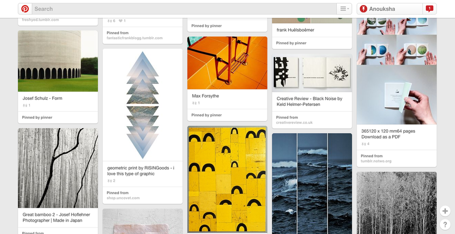
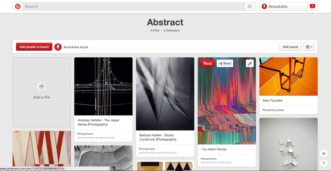
http://www.pinterest.com/anoukshaa/abstract/
|
|
Matthais Heidrich
Matthais Heidrich's work is quite simple with high definition of colour. The photographs have a good focus, as there are no blurriness in the images and the photographs are good quality. Because of the good focus this then makes the color in the photograph, easier to see. The colors stand out the most, as he has mostly bright and high colors, he has not used dull and boring colors so often. One of the main things that I like about his work, is the color. The work itself is so simple but, it's the colors which makes the photographs more satisfying.
|
|
|
|
Bill ArmstrongI really like Bill Armstrong's work as it involves a lot of colour. Also his work is quite mysterious as it is difficult to figure out what is in the photograph, because all the blurriness is in the way. Which is interesting as, although Matthais Heidrich and Bill Armstrong's work have high use of color in them, the one thing is the focus. Armstrong's work is really out of focus, which then makes it hard to figure out what is actually in the photograph, where as Heidrich's work is in high focus, making every inch of the photograph easier to see.
|
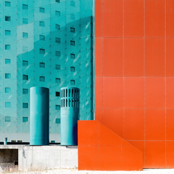
Focus: this photograph is really high definition and easy to figure out, also the whole subject of this photograph is the focus alongside with the color. For example, this photograph has a no blurriness and is in really good focus.
Line & Shape: there are a number of lines in the image. Making the photograph have no curve in it, it's all straight lines with few hints of curves. For example, the tall orange building, has all lines within it, and all of the lines are visible and easy to notice.
Light: there isn't really any hard lighting in the image. However, there is a light reflecting one of the buildings in the image.
Repetition: it's all simple. But, there's a hints of shadows reflecting on the buildings. It is hard to figure out what the actual image is, you would have to look deep into it to figure it out. This may be because of the strong use of color, which makes it difficult to focus on the entire image and not just the color itself.
Space: the space in the image is not so visible. Everything in the image seems to be quite tight, quite close together. So it seems like the photographer wanted the subject to be seen, and everything within the image to look like it's one whole thing.
Texture: the texture in this images looks solid and hard. Although, it also does seem like it has a smooth texture.
Image Evaluation
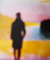
I was instantly drawn to this image, it was the use of vibrant colours in this image, which made me interested in it. I was interested in a lot of his work however, it was this particular image from his "film noir" work, which made me think. I really liked the colours in this image, it almost looked like Bill Armstrong painted this, because of the use of colours, they give a exotic feeling. It's almost like the colours you would see during a sun set, this adds another relaxing feeling. I also liked how there is someone standing towards the left of the image, why? Alongside with the colours the second focus would be the person standing there. It makes me think what they are doing or why they are there. Which is really interesting as I feel like this entire image, makes you question several times. Also, the lack of focus has a dramatic effect on the image. If the image was in full focus then there wouldn't be much curiosity. But, because the image has no focus, it makes the viewer question what the image looks like without the blur. Moreover, Armstrong has made the entire image out of focus, instead of just making a certain area of the image out of focus. This makes it difficult to understand the image, as the entire image has been blurred out.


Summary
I have taken some photographs, which I personally am not really satisfied with. There is a lot of texture in the images however, the whole black and white gives out a lifeless feeling. I had got a inspirations from Bill Armstrong, how his images involve a lot of blurriness, I have also attempted his style by making some of the images out of focus. Furthermore, I also picked up a few ideas from Matthais Heidrich. Heidrich's work looks like it has a hard/solid texture, and involves a lot of focus. Therefore, I have also again attempted to take images based on texture and focus. However, I would like to re-take the following images and experiment more. I want to experiment more looking at texture, light and focus. WWW: What went well is that, I have
Improvements
I would like to experiment more however, use more vivid and radiant colours in my photographs, instead of black and white. The colours will be linked to two of my chosen artists who are: Matthais Heidrich and Bill Armstrong. Because both artists, Heidrich and Armstrong use eye-catching colours, it makes the image look more interesting. I would still like to focus on tone, texture and focus but this time I would like to use more colour. Also, I would like to experiment other places as well, such as different roads and places. Work with more people, as Armstrong involves people in his work but, at the same time work with buildings and roads as Heidrich's work. Collaborate both, Heidrich and Armstrong's work together. I would also like to make the images more in focus and make it clear what is in the image but, at the same time I would like there to be a few blurriness though, it would still be clear what the image is and what the purpose and concept is.
Inspirations
The way that my set of images and my two chosen artists' work are linked is that, it involves focus on some images just like Matthais Heidrich. This makes the images more clearer. I have also focused on things like bins, walls and floor. However, I have not focused on buildings and people which should have been my main aim, that's something that I would like to include and improve in my next set of experiments. Another element which I have attempted to try is, lines. As Heidrich has often used lines. But, I haven't been so successful with my lines. I have linked with Bill Armstrong as well, as his images are out of focus and difficult to understand, this makes the images more intriguing.
|
These three images represent 3 of the formal elements that I am focusing on. The first image is to do with texture, the texture of the bark is clear and focused. Instantly you can tell how the texture of the bark is. The second image is to do with focus. The focus within the image is clear, it immediately captures the texture of the leaves as well. The third image is about light. The image is not very clear, making it out of focus. This is perhaps because of the light, as the light is strong and almost blocks out the rest of the objects in the image.
|
|


Matthais Heidrich Inspired
|
|
I have experimented some more and took images around the school, using a iPod. Overall, I'm not that pleased with the images, as I feel like the quality isn't the best. It's not as HD and focused. Which was one of my main aims; focus. My most successful is the third image. Although, I have not been successful with capturing the whole texture of the building, I have managed to capture my other two main elements which are: focus and light. I quite like how on the right side of the building you can see the stairs reflecting. Despite the fact that the image does not have a strong lighting, the reflection of the stairs is almost perfect. As it simply becomes an attraction, the lighting in that certain area is rich and clear, making it easy to see what the reflection is.
My least successful is the second image. This is because, I was aiming to capture the texture of the building however, I haven't been so successful with it. However, I have managed to capture a few texture in the bricks but it's not clear that I am focusing on texture, it looks more like I am focusing on line rather than texture. Another element which I have not been successful with is lighting. The entire image looks dull and there isn't really anything reflecting, not like the fourth image. ImprovementsFor my next experiment I will experiment with Bill Armstrong's style. But, I will also take some new images which are inspired by Matthais Heidrich, improve my old images. Keeping in mind what I have to work on, I will experiment and improve more images.
DevelopmentI have improved these images from the last images that I took. I have done this by, making sure that I have kept my images in colour and not black and white. I had wanted to take images with colour, so I am quite satisfied with these images. Yet, I have not got achieved three of my main elements (focus, light and texture) but, I have achieved the elements in my last set of experiments. I will be taking more images based on Matthais Heidrich's ideas, I have noticed he takes a lot of images where the sky is involved in the photograph. Therefore, I
|


|
I have experimented more on Matthais Heidrich. At the moment, I have focused more on how he takes photographs of the sky, with a few glimpse of buildings or objects. However, this was quite hard to do, as I had to keep in mind that I also had to focus on my main formal elements. I have achieved mostly two of my elements, which are focus and light. First of all, the focus in all of these photographs is excellent, as you can see the images clearly and is not blurred out. I have also attempted to focus on the light however, I haven't been so successful with it. Due to weather reasons, it was difficult for me to capture good quality lighting. But, in most of the images the sky changes colour half way through, this shows how the lighting slowly starts to fade away. As the sky goes from a blue to very light blue.
My least successful image is the third image. This is because, I have attempted to take a photograph of the texture of the bark but, I have not been successful with it.
My most successful image is the second image. This is because, I am quite satisfied with the outcome. I quite like the different tones in the sky. Another thing is how you can see the reflection in the mirror, I found it quite interesting.
DevelopmentsI would now improve my next set of images by, making sure the lighting is clear and not dark, also to take more images focusing on different textures of different objects and such.
|
|


|
|
I have taken more images which have again been inspired by Matthais Heidrich. I am quite satisfied with this images, however the images could have been improved if the tone and color were to be brighter. Therefore, for my next set of images I would also be focusinng
Overall, I am pleased with the final outcomes as I was aiming for the formal elements, texture, focus and light. I have captured the texture by taking images of the school building. Focus was difficult, as the camera quality wasn't the best, but I am satisfied with the outcome. I will improve the focus on the my next set of images, with a better camera. Light was also in someways difficult, as
I have improved these images from my last experiment I did at school by, looking at the texture of the building
|


|
|
I have taken some more images to experiment. I have kept in mind the two formal elements, texture and line. These images are quite satisfying as I feel as if I've managed to take images that have the two elements within them.
I have also attempted to have line and texture in one whole image, and in someways I haven't been so successful. This is because, it was difficult as for texture I went close to get the image, whereas for the line images I took them from a distance.
I have improved these images from my last experiment by, I have focused on more texture, for example different sorts of texture in nature. Also, I have made sure that the focus was clear and that the image contained more colour.
DevelopmentsI would improve these images by, researching and looking at more artists. People that combine two or more elements together in different ways. For my next set of images, hopefully I will look more depth into the composition and layout. This will make it easier for me to capture images where I'm looking at more than two elements.
|
Francesca WoodmanFrancesca Woodman was born on April 3, 1958. Woodman was an American photographer, who was best known for her black and white pictures, which featured herself and female models.
Woodman's work is interesting, as she involves herself and other people in her images. Her images also sometimes look as if she has naturally captured them, without thinking about the composition. But, also sometimes her images look composed. The compositions in her images is interesting, as in every different image there is a different layout.
|
|
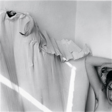
This is one of my favourite images Francesca Woodman. This is because, I am interested in how she used herself/female model in the image as well. By doing this is, she is showing of another formal element, lines. Because of the light, there is a shadow of lines on the sheet. On the right side there is another type of line showing, the woman's arm. Woodman has successfully captured this image, as she has shown lines in different places. For example the lines on the sheet and the lines on the arm. This image looks like Francesca Woodman naturally captured it, without any composing. Another formal element is the light. The is a bright light forming lines on the sheet, this adds a different tone.
|
|
Paul StrandPaul Strand was an American photographer and filmmaker who was born on October 16, 1890.
The layout of Paul Strand's work is well composed. I quite like how Paul Strand thinks about his composition, how he captures the images. Strand and Woodman's work look similar,
|
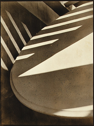
This is quite an interesting image by Paul Strand, quickly you can figure out the formal elements within this image. One of the first formal elements is tone. In the image you can see very well that there are two main tones, light and dark. In few parts of the image there is a bright tone this is because, of the lighting. Because the light has been reflected it has caused a shadow, this showing that the entire image isn't in just one colour. Another element that is visible, are lines. The lines are sharp and in focus, because the whole image is in clear focus. There also isn't a gradient effect, that shows the change in the light and dark tone. There is simply an area that is light and an area that is dark; the image doesn't show how this effect is made. This is also because, the shadows don't look natural, it looks forced. For example, it looks as if the photographer has used artificial light, e.g. a lamp to create the difference between tone,
Developments
I am now planning to look more depth into Francesca Woodman and Paul Strand's work. I have already researched both of the photographers and looked at a few of their work. My main elements are: texture, focus and light. I thought both photographers involved a lot of texture, focus and light in their work, therefore I was instantly drawn into their work. I also became really interested in how Francesca Woodman would get herself or female models, involved in a few of the images, it's quite unique and different from what I've done so far. This is something new and I also would like to experiment with having people within the images. I will be doing this by taking more images, inspired by Woodman and Strand.
Links
Although, there aren't many links between Matthais Heidrich, Francesca Woodman and Paul Strand, there's one thing I've noticed. A few of Paul Strand's work is quite similar to Matthais Heidrich yet so different. For example, Heidrich takes many images which involve buildings and such, on the other hand I have seen images of buildings as well but taken by Paul Strand. Therefore, I will be focusing on different textures of buildings. However, I have found some small connections between Matthais Heidrich and Paul Strand, I have not found any between Heidrich and Francesca Woodman. But, one of the reasons why I will be focusing on Francesca Woodman as well, is that I am inspired by the images. They link very well with my three main formal elements: texture, light and focus.
|
|
EvaluationI have taken more images, inspired by Francesca Woodman and Paul Strand. It was difficult to take images similar to both photographers, but I am satisfied with the final outcomes. I have been inspired by Francesca Woodman in a few of the images that I have taken. For example, I have involved myself in the images, pretty much like what I've seen Francesca Woodman do with her work. It was quite interesting and fun to do, also something new that I have experimented with.
I have also been inspired by Paul Strand, but personally I don't think the images inspired by him were so successful. This is because, when taking the images I didn't really have his work in mind, in some areas I wasn't so sure of what kind of images I was taking.
|


Photoshop Experiments
|
The four images on the left were inspired by Francesca Woodman. I was inspired by Woodman to take some more images which didn't just involve buildings and such, but to take images which involves buildings and people. I have taken these four images and my most successful is probably the second image. This is because, the arm on the right is quite interesting. For example, the arm adds a different feeling towards the image, how the arm is just there. I did think about the composition a bit, but I tried to make it look like as if I hadn't thought about the composition. I had looked at few of Francesca Woodman's images, I realised that some of her images look well composed yet again they looked very natural. Therefore, I think the second one is the most successful, as I have picked up some ideas from Francesca Woodman to make the image complete. However, I do think the image could have been improved. For example, I could have focused the image a bit more to make it clear, but I used a iPod to take these images so I had difficulties taking the images in good quality. |


|
To develop my images, I have used photoshop to edit the images. I haven't really edited the images dramatically, all I have done is change the tone so instead of using colour in the images, I'm using black and white or sepia. This really brings out the tone and light, and light is one of my main formal elements. However, this is a change as in my previous experiments I had been trying to focus on the colour and texture, whereas these images have no colour expect for black, white and sepia. I was inspired by both photographers: Francesca Woodman and Paul Strand. They have inspired me to use the black and white effect as well as the sepia effect. When editing the images, I was strongly focusing on changing the colour of the images. My most successful one is the first one. Although, the second image looks similar to the first one, with just colour difference, I prefer the first one. This is because, the black and white creates more tension and tone in the image than the sepia effect does. Focusing on how Woodman creates depth in her images using the tone, similarly I have done something similar to it. Moreover, the use of the hand shown in the corner, adds on to this intense feeling.
|
|


Pixlr Experiments - First Set of Final Pieces


Evaluation
I have picked these three images as my final pieces. Overall I am quite pleased with the final outcomes. I have been inspired by Francesca Woodman and Paul Strand, I have picked up some inspirations from their work and used it in my own images, this way it has helped me develop my experiments and improve my images. I've taken the images using an iPod, which I've later edited using photoshop.
What went well with the first image is that, the arm on the right corner is intriguing. This is because the arm seems accidental for example, it looks like it has been accidentally captured. That there was no intention to take the image with the arm being in the image. This also creates a mysterious feeling with the arm there, it questions whether there is a message behind the image and composition of the arm. Moreover, the effect used in the image also creates a
The images are satisfying however, the second image could be improved. For example, the image could have more focused; this way it would the image clear and less blurry. Also, the image with stand out more.
Second set of final pieces


Evaluation
These set of images have been inspired by Matthais Heidrich. I am satisfied with the final outcomes.
What went well, is that one of my main three elements was texture, which is difficult to see but I personally think I have managed to capture the texture of the building. However, I haven't been so successful with my other two elements: light and focus. This is because, I had used an iPod to take these images therefore, it was difficult to make the images more focused. Another reason for why I have be unable to get light in the images, is because of
Even better if, the quality of the image was better for example, the focus. Also with the focus if the brightness of the images was improved. Overall, I am pleased with the images.
Final project evaluation
During this project about abstraction, I have developed my researching, experimenting and developing skills. I was able to be free and independent on this project, therefore I was able to extend my ideas. I began with finding out what abstract truly meant, this helped me look at abstract photography through a different point of view. By doing this, I was able to go out on my own and find artists which I found intriguing, One way which I found some of the artists was from the tallis pinterest account. Tallis pinterest was very useful for me, as at first I did not know how to find artists that did abstract related work. Pinterest let me search up artists' work and also I was able to find more related artists. Once I had chosen artists to research, I evaluated one of their work; where I focused mainly on the formal elements. I found it easier to evaluate someone else's work, as I was able to improve my evaluations, which then helped me evaluate my own work. When I had researched artists, I had a clear understanding of what kind of photographs to take. I finally started the experimentation, where I went around taking photographs around the school and outside of the school. I tried to take as many images as possible in case I wasn't entirely satisfied. After I had taken a set of images I evaluated them, this helped me look at my work and decide for myself whether the final outcome was up to my standards or not. Although, I had experimented and taken a set of images I was not ready to present them as final pieces, therefore I went back on tallis pinterest to search for more artists. I came across Francesca Woodman and Paul Strand. At first, I did not find their work so alluring thus, I did not want research nor look their work in depth. However, after looking at some of their work, I became interested. I researched both artists and went out to experiment. Finally, after taking set of images and evaluating them, I choose around six images which I chose for my final pieces. Overall, this project has helped me a lot moreover, I have learnt from this project as well. I was able to be independent on this project, which allowed me to work on my own with my own ideas,
