Contrast
|
Contrast: noun ˈkɒntrɑːst, verb kənˈtrɑːst/ is determined in the color and brightness of an object within the image. If a image has high brightness the contrast would be higher, whereas if the brightness is quite low and dim the contrast would be low.
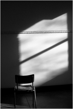
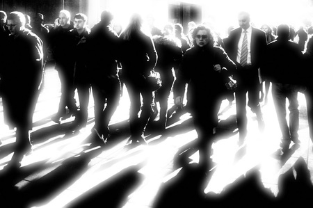
Chiaroscuro (English pronunciation: /kiˌɑːrəˈskjʊəroʊ/; Italian: [kjarosˈkuːro]; Italian for light-dark) is the strong contrasts of light and dark in art, which usually affects the whole composition of the image. It is an Italian term which means 'light-dark', it is a technical term which artists and art historians used of contrasts of light to achieve a sense of volume usually in three dimensional paintings. The term chiaroscuro can also be used for photography and cinema.
The image on the right is an example of chiaroscuro.
|
|
Sally Mann
|
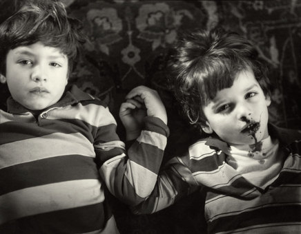
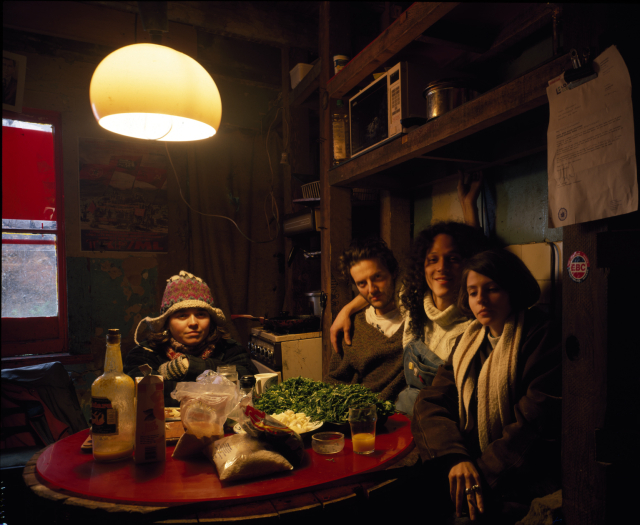
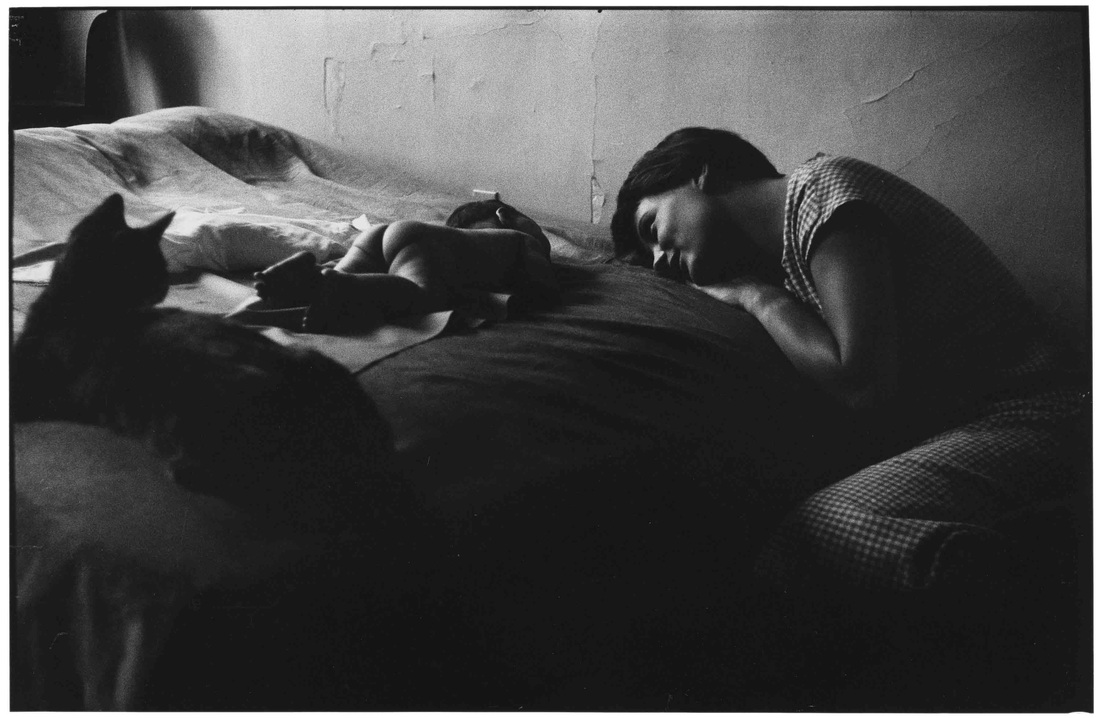
Sally Mann was born in Lexigton, Virginia on 1951.
Her work is simple yet effective. I really like the way she composes her images, the way every object is laid out. There is simplicity but the contrast within the image is intriguing, also the composition of every object within the image. “Few photographers of any time or place have matched Sally Mann’s steadiness of simple eyesight, her serene technical brilliance, and the clearly communicated eloquence she derives from her subjects, human and otherwise – subjects observed with an ardor that is all but indistinguishable from love.” |
Edward WestonEdward Henry Weston, born on March 24, 1886 and died on January 1 1958. Weston was a 20th-century American photographer.
I personally found Edward Weston's work unusual but, it's interesting at the same time. One of the things that I liked about Edward Weston's work is that, the angles that he captures things is different, this way the objects become the centre of the attention. The contrast is very effective, for example within the images there's different tones, this gives the image more of a high defination effect. Furthermore, I like the way Weston edits his images, by doing this he is making the image stand out more and give it more definaition.
|
|


Edward Weston response
|
I have experimented Edward Weston's style of taking photographs. I've taken images using my phone which I've later then edited using a app called VSCO Cam. VSCO Cam allowed me to change the image to black and white and also increase the contrast, however I have only increased it by slightly.
What went well, is that I quite like how the image came out, for example after I edited the image I was more pleased with the outcome. Even better if, the images could have more contrast. For example, unlike Edward Weston's work, my images aren't high in contrast. Therefore, the images do not look so bold and in focus. Moreover, if I could improve these set of images then I would focus more on the lighting, this way I will perhaps get a higher contrast also the image will hopefully stand out more. Instead of having like a light faded effect, it will have more of a bold and focused effect. Although, I have experimented taking images from as many different angles, the images could've been improved if I had tried even more angles. For example, if I took images from a unusual angle then it would make the object look different.
|
|


Sally Mann response
I've taken a set of images where I have been inspired by Sally Mann. There were some difficulties as I was unable to get the lighting right, therefore the images came out bright and high on contrast. However, this is my first experimentation which is linked with this project, so in the future I will try to get more experience and ideas to improve my work. WWW: I've taken fairly satisfying images, where the light reflects and shows a fine line of contrast. EBI: If I had thought more about the composition within the images. For example, if everyone in the photograph was composed then the outcome would be even better. However, some of these images are composed but, if the camera angle was changed, it would look more composed.


Elliott Erwitt
|
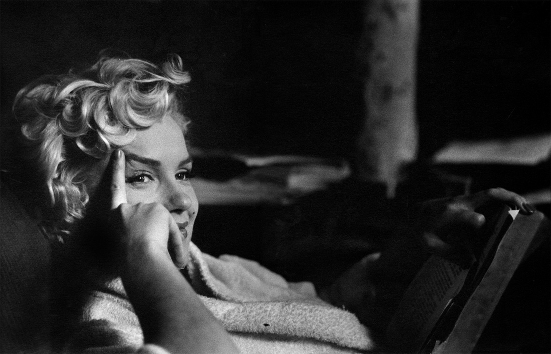
Elliot Erwin was born on July 26, 1928 in Paris, France. Erwin is an advertising and documentary photographer, mostly known for his black & white candids. He has also captured the iconic Marilyn Monroe.
Personally, Elliot Erwitt's work is really simple yet the black & white effect gives it meaning. I looked at a few of his work and found them quite interesting, the images either looked like they had a story behind it or they were just casually taken. Moreover, the way Elliot Erwitt takes his photographs suggests that perhaps he views everything differently compared to others. For example, this image of Marilyn Monroe shows that maybe Erwitt was trying to focus more on her and her facial expression, therefore the background is quite blacked out and hard to understand. That she is the main focus of the entire image.
|
|
|
Francesca WoodmanFrancesca Woodman was an American photographer who was best known for her black & white photographs, which featured herself and female models.
I have looked at Francesca Woodman's work in the past. Woodman's work is creative, she turns a simple image with simple effects into something that's so questioning. I don't understand Francesca Woodman's concept behind her images, but her work is quite feminine and include many women.
|
Tom HunterTom Hunter, born in 1965 is a London based artist who is works in photography and film.
Unlike the rest of the other artists that I've researched and looked at, Tom Hunter's images are in color instead of black and white. Moreover, because of the color effect it adds a deeper meaning to the image. For example, especially the use of light in this image. The light one the left seems to be brighter, this creates a lighter tone to the the image. As the lighting on the left, it gives the left side of image more of a brighter tone and slowly it sooner changes to a dark tone.
|
|
Experimentation
|
|
I've taken a set of images. However, I am not so satisfied with these images, therefore I would like to improve these images by editing them. One of the main reasons to why I am not pleased with the outcomes, is that the images are in colour instead of black and white. This is one of the things which I would like to improve, by doing this the contrast between light and dark would be easier to see and figure out. However, I was supposed to take 10 images, which I have not done therefore, next time I will keep in mind to take more images. Overall, the only improvements that I would really like to make would be to change the colour of the images, I would do this by using Pixlr which is an website, that will allow me to change the images to black and white. This will also show a contrast between light and dark.
|


|
I have edited my set of images using a website called Pixlr. Pixlr allowed me to change my images to black and white, which made the tone stand out more. For example, after editing the images there is more tone, different tones of white and black.
What went well was that after editing the images, I am able to show an understanding on contrast. For example, the first and last images have various of different tone within them,
Even better if, the images were more composed and thought about. If I had thought more about the composition of the images, then my outcomes would have hopefully been better.
|
|


|
This is one of Elliot Erwitt's images. I think this image is really interesting as there isn't much light within the image, there is more dark rather than light. There is a little light coming from the left, however it isn't a lot, not compared to the darkness on the right. The tone slowly fades from light to dark, starting from the left side of the image. Because the image is so dark it is hard to notice the cat in the left side of the image, although you can't see every detail of the cat you are able to see it's outline. This shows that the photographer is trying not to focus on certain things, for example the cat,
|
|
|
|
I have experimented a bit more with this topic. These images were inspired by the artists who I researched.
I was inspired to focus on people and movements within the image, something like Tom Hunter has done, for example capture the moments instantly. I haven't been so successful, however I have now noticed the areas which I have to study more on, so my next experimentations turn out to be better.
One way in which any of these images could be improved is that if you could see the person's face. This would've gave a better understanding on what the main focus is doing.
|


Using Pinterest, I have found a few images that I'm interested in.
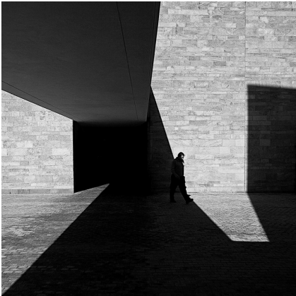
Serge NajjarI found out about Serge Najjar's work through Pinterest, the website allowed me to discover photographers that I might be interested in. Najjar is located in Beirut, Lebanon.
I really like the way Serge Najjar takes his images, the contrast between the light and dark really defines the whole image. For example, with this photograph there is a lot of light coming through both sides however, in the middle it is pitched black. As the lighting is very sharp, the image also gives a abstract feeling to it.
"It is not about what you see but how you see it" |
|
|
Michael PennMichael Penn's work is different to Serge Najjar, especially if you compare this image with Serge Najjar's image on the top. For example, unlike Najjar's photograph, this image is very out of focus and blurred out. Moreover the light used in this image is very sharp and bright, unlike the image on the top. Another thing is the composition, this looks unnatural. This meaning the composition of the image doesn't look well planned out and the image was taken in the moment. However, at the same time despite the layout of the image looking effortless it also looks like Penn has at least taken some time to think about the composition and angle of the image.
|
Experimentation


Evaluation
Overall, the images didn't turn out to be so bad, as I was pretty satisfied with them. However, there are a few areas in which I could improve on. For example, some of the images don't clearly show the contrast between light and dark, therefore I haven't been so successful in taking the images. I have taken a few images which are in color, but I will edit them to black and white using photoshop, by doing this it will show the difference between light and dark. Due to the weather being sunny, it allowed me to take images in the natural daylight, which is what I was going for, capturing light.
I have taken some more images as part of my experimentations, the images were mainly inspired by Serge Najjar and Michael Penn. I focused on taking pictures of the natural daylight, and the contrast between light and dark, mainly because the topic is on it moreover, I had also been inspired by the two artists whom I researched. But, mostly I was focusing on Serge Najjar and his style. This is because when editing, I am inspired by Michael Penn's
WWW: One of the things that possibly went well was that I took pictures in the natural daylight. This way there was more light and I was able to take pictures showing the contrast between light and dark. Another thing that went well is that I quite like the composition of these images, for example the ninth image. It is clear that the image as been taken from an angle that faces
EBI: The images could be improved, for example the composition of some of the images. It could've been improved by changing the angle of the camera, to give a different view of the image. Furthermore, another thing which could be improved is the images with color, they could've been black and white. But, I will later be editing the images using photoshop. Another thing would've been that there were people within the images, however both photographer's are different. Looking at Najjar's work, it's quite abstract whereas Penn's work looks quite street photography type.
Photoshop Experiments and Evaluation
I have used photoshop to edit some of the images, to a standard which I am satisfied with. Photoshop has also allowed me to experiment with the images, and change the tone and contrast within the images. When editing, I have been inspired by Michael Penn. I haven't edited the images a lot, but one of the things which I have done is increase the contrast, or decrease the brightness.


After experimenting, it's given me more confidence to look further into the topic, which is contrast. I used photoshop to edit the images. What I did was change the brightness and exposure of the original image, but before that I would have to change any image which was in color to black and white. Due to the original image being in colour.
One of the most successful image is the second one, this is because the light reflects in a certain direction. For example, the lighting fades from dark to light from the right side to the left side, one side is darker than the other side showing a contrast between light and dark. Moreover, I also like the composition of the image, the image is viewed as looking up, for example the camera was faced up when taking the picture. Which again makes the light the key element. Another image which turned out quite successful too, is the first image. This is because, the light comes through the right side, which makes one side more dark than the other side. Both of the images involve, light, line and shadow.
One of the least successful image is the fifth one. The reason for this is that, I don't like how the lighting is reflected. For example, one the left corner of the image, the lighting is very strong and exposed, whereas on the right side the light isn't so bold. Another element which is quite visable in this images is line. Although, I wasn't really expecting to have lines within the images nor was I intended to but, most of the images also have line involved.
|
|
I edited these two images again. Here, I was inspired by Michael Penn. When it came to taking the images, I had been inspired by Serge Najjar however, when editig I kept Michael Penn's ideas in mind. This allowed me to mix two artist's work into one image. Penn's work seemed quite sharp and exposed therefore, using photoshop I sharpened the images that I previously edited, making them look more bold. I also changed the brightness and contrast of these images, to increase the contrast between light and dark.
|


|
|
I've taken these three images experimenting with light, looking at different angles. This is to just give me a brief idea of the composition, so next time when taking images I would have a better idea of different angles of light.
The middle images seems to be more exposed to light than the other two, this is because I put the focus on the background rather than the light.
|


|
Daido MoriyamaDaido Moriyama is a Japanese photographer, born in October 10, 1938.
I am interested in Daido Moriyama's work for various reasons, for example I like the way he captures his images. His images look composed however, with no effort. This image by Daido Moriyama is quite intriguing, as you can't see the person's face but they still seem to be the main focus of the image. As the girl has been placed in the middle of the image, showing that the composition is quite central and focused on one thing.
|
Morten AndersenMorten Andersen is a Danish fashion photographer, who began his carer as a model working for Hugo Boss and Giorgio Armani.
Morten Andersen's work is similar to Michael Penn's. I'm really interested this is specific image by Andersen for example, the entire image is black expect for the centre, the centre has tone and contrast. The centre of the image is where the light has been exposed the most, however the shadow of a kid has no tone and is completely black. It is obvious that the centre is the main focus, as it involves a wide range of tone unlike the rest of image which only consists of one shade of tone.
|
http://www.mortenphoto.com/
|
Next Plans
I've researched two more photographers that I like. There are some similarities and differences between all of their work, they all work with black and white image. What I plan to do with this is to possibly combine various photographer's style together in which my own images will stand out and look different, but at the same time similar to the chosen photographers. I will begin off with experimenting with each photographer individually, later then experiment using apps and photoshop. Apps like VSCO Cam or Afterlight.
Morten Andersen Response


Further Experimentation and Evaluation
I've edited the original images using two apps called, VSCO Cam and Afterlight. For some I changed it to black and white and for those images that were already in black and white, I just increased the exposure to make the contrast between light and dark even more visible. Moreover, I also used Picmonkey to change the focus, also Pixlr to change effects.
I used VSCO Cam to change any images that were in color to black and white.
When it came to editing I was more influenced by Morten Andersen. I really liked how his images looked, the blur and out of focus images were really intriguing and eerie. I have tried my best to produce some work similar to his, but not completely the same. For example, I have changed the focus on some of these images, making the images out of focus and only focusing on a certain area of that image. Something which I've noticed in a few of Andersen's work. he focuses on a certain area rather than the entire image. Although I do personally think these images could be improved, composition wise. Perhaps if I had thought more about the composition, where each object within the image was placed then I would've probably be more satisfied by the final outcomes. This is because, I've noticed both artists focus a lot on composition as each of their images look well composed and thought out, if I also pick up on this then hopefully my next set of experiments will be better. Overall, I am pleased with the images after editing them, especially the ones with the out of focus type of effect.


|
The images are screenshots showing my experimentation with the images I took previously. This is to show how I was able to achieve the final outcomes of each image. I have mostly used the effects "B1" and "B5" alongside with grain effect. The reason why I have done this is because, I wasn't completely pleased with the orignal images which is why I felt the need edit the images for a better outcome. VSCO Cam was a really useful app to me, as I was able to change the colour and tone of the images, allowing me to look deeper into the idea of contrast.
|
|
|
|
Daido Moriyama AnalysisI have been influenced by these images by Morten Andersen. For example I've noticed that his images are blurred out, not in focus which creates an erie tone. Therefore, by picking this up I've done something similar to my own images. First of all, I changed any images that were in colour to black and white, then changed the focus of the image, making it out of focus and blurry.
|


Daido Moriyama Response
As a response to Daido Moriyama's work, I've took images inspired mostly by him, which I later plan to edit and experiment using photoshop. I am pretty pleased with these set of images, but at the same time I think they could be improved too. One way I can improve these images, is by using photoshop. By doing this I will be able to change the tone of the images, making it black and white which is my main objective. When taking the images, I focused more on Daido Moriyama's compositions, therefore most of the images are focused on the composition as I really liked the way Moriyama composed his images.
|
WWW: With the first set of images, the unedited ones, I like the composition of each image. Before taking the images, I thought about how I should compose it first, as I was intrigued by how Daido Moriyama composed his images. The compositions of his images is simple yet well laid out and thought about. But, looking at the unedited images I have been able to refine and improve them, by using photoshop.
EBI: One way the images could be improved is by retouching the images on left using photoshop, by doing this I can change the colour and tone of the images, making them stand out more.
|
Improvements |


Display Strategies
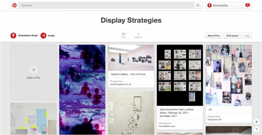
Using Pinterest I've looked at some display strategies to help me when presenting my final pieces. I think this would be useful as I've previously done this, and
FINAL PIECES AND EVALUATION


For my final piece I've chose these images from my work. To achieve the final outcomes I've experimented with my images, which allowed me to improve them. I researched some artists who's work I was interested in, and from there I got some ideas on how to take images. I started off with Sally Mann and Edward Weston, although their work was interesting I wasn't entirely satisfied with it, and felt the need to research more artists. Then I went on and researched three other artists; Elliot Erwitt, Francesca Woodman and Tom Hunter. All of their work was quite different and I wasn't so sure how to link their work up, but I still went on to experiment and took images inspired by each artist. It was when I started researching Serge Najjar and Michael Penn, that I was satisfied and intrigued with contrast. I understood how to takes images relating to contrast after experimenting with various artists, as all of their work was different it gave me a rough idea to how to capture contrast within an image. I started experimenting with both Serge Najjar and Michael Penn's work, I found it quite easy as their works were similar, but I did find some bits difficult. For example, I had a problem with the composition, I wasn't satisfied with the compositions of any of the images, which I later tried to improve by experimenting more, which made me more confident when it came to taking more pictures. The first image is inspired by Serge Najjar and Michael Penn, I looked at Najjar's work when taking the image, which meant that I would have to focus on the composition and the focus of the image. Najjar's work is simple so I knew exactly what kind of pictures I was expecting to take. Overall, the images turned out not too bad but, I later edited some of the images using photoshop for a better outcome. I have also been inspired by Morten Andersen, for example with the out of focus images. I liked the idea of images being out of focus but only certain areas, I first took images which I edited afterwards using Pixlr-O-Matic and Picmonkey. Pixlr-O-Matic allowed me to change the images to black and white, and by using Picmonkey I was able to. As the theme was contrast, it was sort of not an option to change the images to black and white. But, by changing the images to black and white, it linked with chiaroscuro. This meaning that, the images showed a clear line between light and dark, which is mainly what chiaroscuro means. In conclusion, throughout this project I have been able to
WWW: Keeping in mind the idea of contrast, I have tried to capture contrast in every image, the contrast between light and dark. Most importantly, the reason why I've chose these five images instead of the rest is quite simple. These images are layed out in a sequence, for example one of the things that they all have in common is line. However, the lines in all images don't go in a straight line, they go in a diagonal line instead. Another element that is common between the images is shadow. The shadows are dark enough to notice them clearly in every image, for example in the fourth image, the shadow is sharp making it the main focus of the image. One of my most successful image is the first one. This is because of the angle and light within the image, for example the light is most effective on the left side of the image, on the other side there isn't much light and is just one shade of tone.
EBI: In my opinion, these images could be improved in terms of composition but overall I am satisfied with the final outcomes. Although I did have some difficulties throughout the project, for example at the beginning I wasn't entirely sure of what kind of pictures to take. Such as, I would go out to experiment and not have an idea of what kind of pictures to take, despite already researching artists. This is because, I hadn't completely understood the idea behind contrast, which is why I wasn't always so satisfied with my work at first. However, later on I started looking more into other artists, this allowed me to look at various different techniques, which then gave me a better understanding on the whole idea of contrast. Overall, I have tried my best to explore the theme completely, looking at different artists and techniques, which gave me an advanced understanding on the theme.
