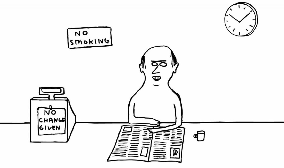
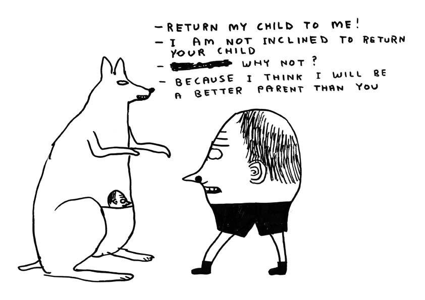
ABSURD
|
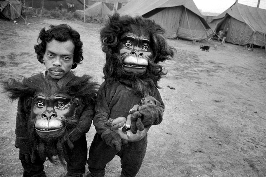
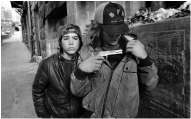
Mary Ellen MarkMary Ellen Mark was an American photographer.
What I really like about Mary Ellen Mark's work is that it is also street photography based. She seems to capture images that seem quite natural but at the same time the situations within the images don't look like everyday situations. Which is why I'm so intrigued by her work, as it's a mix between street photography and absurd. Mary Ellen Mark seems to capture people often doing unusual things, he captures reality in some aspects.
|
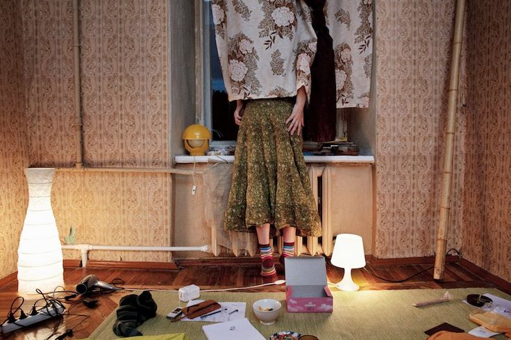
Pavel ProkopchikOne thing that's really interesting about the image on the right, is it's layout. The objects within the image look like they have been placed there, but at the same time the objects look as if they were just randomly chucked in the room. Which is one of the things that I really like about this image, is that it has so much going on within it. For example, the lady standing is the main thing that makes the image look absurd. As she is standing while her face is hidden using curtains, makes the viewer question what is actually happening. The background of image involves a lot of floral, which at the same time the curtains and the woman's skirt are also floral. It is like a camouflage, as the woman is hidden not only using the curtains but the floral in her skirt and curtains blend in with the background. Because of this it is easier to pick up on the objects on the floor first, it is almost as if the woman is not on the image. Because there is so much happening in the foreground, with items scattered on the floor, it is difficult to notice the woman first. This in some ways creates an eerie effect, as it takes time to notice the woman, it is almost like she appeared in the image all of a sudden. This makes the image look absurd, Pavel Prokopchik has used the idea of hiding, and has blended the woman in with the background which makes it difficult to notice the woman first.
|
|
|
|
|


|
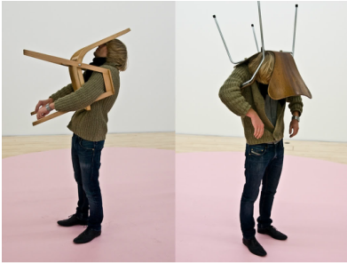
Erwin WurmEdwrin Wurm is an Austrain artist. He is widely known for his photography and sculpture.
Looking at Wurm's work, it is very absurd and unusual but also creative. His photographs don't seem to make sense, in a creative way, which is interesting
For example, this picture on the left is actually one of his sculptures. The image is unusual, as the way the man's holding the chair seems confusing. The viewer doesn't know what's going on, which makes the image so intriguing to look at. Wurm's work here is quite similar to Pavel Prokopchik's, both photographers have used the idea of hiding. For example, unlike Prokopchik whose backgrounds are intense, Wurm's backgrounds are kept plain. Moreover, with the composition of this image, the man is standing at the centre which instantly draws attention. With the background being plain and the composition of the man being central, it doesn't distract the viewer and the man becomes the main focus of the image. What makes this image unusual is how the man is holding the chair, the movement of the man is still and isn't hesitant, he is simply standing still with a chair covering his face. |


David ShrigleyDavid Shrigley is a British visual artist, born on September 17, 1968.
I have looked at David Shrigley's work, which is very unusual and different. I don't really understand his work, as it involves a lot of sarcasm and jokes, something quite similar to Erwin Wurm. This is because both artists view their work as weird and different. I also wanted to experiment with visual digital work, therefore David Shirgley's work is different to the other artists. Shrigley's work is plain and simple, but with the use of writing and drawing it draws more attention, and you can view the image from a different perspective.
|
|
Experimentations and Evaluations
Erwin Wurm
I have taken a set of images inspired by the theme, absurd. Although it was quite fun taking these images, as I got to work with a wide range of props, it was also at the same time quite difficult. This is because I wasn't so sure of what kind of pictures to take, as I've never really looked into the idea of an image being abnormal or weird. I took these images using an iPod, so I'm not so satisfied with the quality of images, but to make the next set of images slightly better I will use a different type of camera.
WWW: What went well with these set of images is that, I quite like how some of these images are composed. For example, images where I had used a mask or chair to hid the face were mainly inspired by Erwin Wurm. These kind of images are confusing, as the viewer isn't so sure of what is actually happening in the picture. Which in my view is the idea of an image being absurd.
EBI: These images could be improved by a number of reasons. For example, some of these images could have been more planed out. Such as the layout of an image, I could plan out how I was going to use a certain prop and from there think about the composition of the image. But overall, I personally think that I could work on the composition of these images. In order to be more successful in my next yet of experiments, I will focus more on the composition of the image, and use my props wisely.


Erwin Wurm Response
|
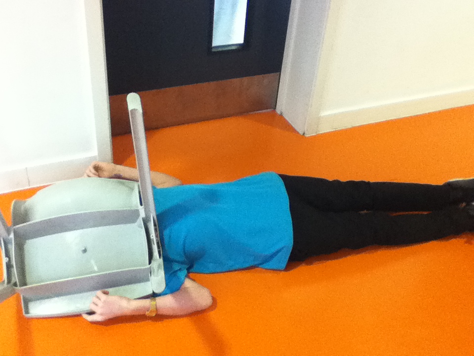
This image has been the most successful, I have also been inspired by Erwin Wurm specifically. With the composition, looking at Wurm's work, the composition of the objects in his images were quite central. Similarly, with this image, there is a boy laying down at the centre of the frame, which straightaway becomes the main attraction. Although, the background could be improved for this image, for example, there is a black door at the back, the image would've looked more appropriate with just the orange and white. Because of this, there is too much focus on the background. Therefore, to improve this image I will retake it again with the same background, except with just an orange and white background, not include the back, However, another thing which was successful about this image is the use of prop. I have used the chair as a prop appropriately my main aim was to have the person hold the chair in a casual way that will cover their face. For this I had been inspired by Erwin Wurm.
|
|
|
I have taken a series of images using my phone that were inspired by the theme absurd. I found it quite difficult as I didn't understand the concept of absurd completely nor how to capture it, however I have attempted my best. I tried to capture images that were considered not normal, but it was difficult as I wasn't sure of the composition .The composition was one of the main things, as I had to be sure of where to place the objects in my images and what angle to take the image from. The idea was to focus on certain angles, and compose possibly each object within the image, Another thing that I found quite difficult was, how to take the image. For example, what kind of objects to have within the image to make the image itself look confusing. WWW: I was able to capture some aspects of absurd, the idea of images not feeling right. But I wasn't so sure, therefore I am not so pleased with the outcomes. All of these images were inspired by Erwin Wurm, for example in one of Warm's work there was a man holding a chair and and background of the image was plain, which didn't distract the viewer. EBI: The images could be improved, but due to low knowledge on absurd I did struggle. Therefore, to not to repeat the same mistakes and improve my work, I will research more artists and get a better understanding on the whole idea of abusrd. This way, hopefully my next set of images will be more detailed and relate to the theme.
|
|
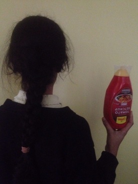
Continuing with looking at Erwin Wurm and his concept of using props, I have taken this image inspired by him. Out of my previous experiments, this one has been the most successful. This is because, the background of the image has been kept plain, which isn't distracting and the main focus goes to the girl holding the bottle. In the foreground, there is a girl holding a bottle. The composition of the girl is slightly to the left but with her hand and the bottle also in the frame, it gives an illusion of the composition being quite central. To experiment, I have been inspired by Erwin Wurm to use props in my images, therefore I have used a bottle. Previously, I had used chairs that was used to cover the face, however here the girl is facing the wall, so you can not see her face. What's interesting about this image is that there is no movement in the girl, she is kept still facing the wall holding a bottle still. Again, this concept had been inspired by Erwin Wurm, it is a still image with no movement and the person within the image is holding an item in a casual manner. In some ways, this gives an eerie feeling to the image, as you can not see her face and her still body language holding a bottle which is faced upside down gives an unusual feeling.
|
|
Improvements and EXPERIMENT - Hiding
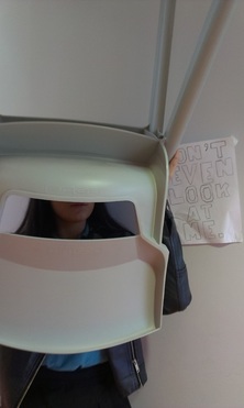
WWW: What went well with these images is that, I quite like how some of them turned out to be. For example the first, fifth and last images are quite successful. This is because I aim was for images to be hidden in a certain way, and with these images some bits of the face or body is covered. The most successful is the last image, here I was inspired by Erwin Wurm and his sculptures. For example, the way she's holding the chair and hiding her face fits in with the background. As in the background there is a sign saying "don't look at him", and her actions show the sign clearly.
EBI: These images could be improved, colour and quality wise. For example, these images could be slightly sharper, to make them stand out more. Looking at these images, some of them don't exactly apply to the theme "hiding". For example, the sixth image. What's wrong with that image is that it doesn't fit in with the concept of hiding, unlike the other images where it is obvious that the theme is hide, as there are people or objects in the image that have been hidden. However, with this image, there isn't a main prop used. For example, with the fourth image, it is obvious that I have used a chair as a prop to hide the half of the face. But, with the sixth image it looks rushed, as I have not used a prop nor thought about the composition I could've taken the image from another angle, and hide something in the image, this would've worked without using a prop.
I've taken a set of images, the main topic of these set was "hiding", which is to take as many images a possible where people within the image are hiding. I had been inspired by Erwin Wurm and Pavel Prokopchik. Keeping in mind my previous experimentations, I planned to focus on the composition of my new set of images. Therefore, with these images I have focused on the composition as much as possible. For example,
In order to improve my images, I plan to take another set of images but also to edit the previous set. I plan to focus on the composition and colour of these images,


|
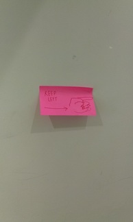
This image is the most successful, because it fits in with the concept of hiding, Erwin Wurm and David Shrigley. I have used inspiration from Erwin Wurm, by using a chair as a prop. Similar to his work, the girl is holding a chair, but it doesn't exactly fit in with his work. For example, if the girl was holding the chair in a different position. Because, at the moment it looks as if she just lifted the chair up, and took a picture. To improve this, I would have to change the composition of the girl, but change it so you can also see the sign behind her. With the sign, it was David Shrigley inspired. The sign fits in with the girl, as the signs tells not to look, and in response the girl is covering her face. Concept wise, this image is the most successful. However, this image could still be improved. The lighting of the image is slightly too dark, if this had been an Erwin Wurm inspired image then the lighting would be also have to be bold and harsh lighting.
|
|
|
I have taken a set of images continuing with the theme. I am more satisfied with the outcome, as I have a better understanding on absurd photographs than my previous experiments.
WWW: What went well with these set of images is the composition of some of these images.
EBI: These images could've been improved. For example, make some of these images look even more absurd, and changing normal objects to something unexpected. For instance, the image where the girl is holding receipts looks very normal, therefore to make it seem more absurd, the girl could've been holding something else, something quite unusual. Also, some of these images don't look well composed, maybe with my next set of experiments I will focus on composing the images more thoroughly. For example,
|
David Shrigley Experiments
Improvements and Evaluation
I've taken another set of images as part of my experimentation. These images were specifically inspired of David Shirgley, I liked his idea of making signs the main subject of the images. Also how his signs didn't make sense or sounded weird, which related to the idea of a image being absurd. Also, I liked the idea of weird and unexpected signs, looking at Shrigley's work it's very unusual with creative words used, he thinks differently which I found interesting. Keeping in mind his work, I was influenced by his style to take some images of my own, using signs.
WWW: What went well with these set of images is that I had a better understanding of what kind of images I was hoping to take. Because of this, I was able to think of the composition and layout of these images more thoroughly. Some of these images came out successful, whereas some of the others didn't. For example, the images with a plain background were more successful than the images that had something happening in the background. The foreground had just the note, with writing, and the background is plain. This would instantly draw more attraction to the note. Hence, images with a plain background worked out better. Furthermore, looking at Shrigley's work, his backgrounds are also plain.
EBI: These images could've been improved, maybe if I was to take another set of similar images where writing was involved, then I would focus more on the background.


|
WWW: Inspired by David Shrigley, I made signs of my own that didn't make sense or was unusual. One thing that I like about these images is how the background of the image fits in with the signs. For example the first image, the sign says to keep left which is weird because it's pointing right instead of left. Along with that the person walking behind the sign is walking towards the left, which goes with the sign. This is because, the sign indicates something different to what the person is doing, which shows the image being absurd.
This image has been the most successful. This is because it fits in with David Shrigely's work, for example the plain white background. Because the background is plain, and the note is pink then plain background doesn't take up any attention. Most of the other images have something happening in the background, but with this image it fits in with David Shrigley's concept of everything being simple and the writing making the image look effective. Although, this image could be improved for example, the background could be more clear focus and brightness wise. If the background was more focused and brighter and the sign was also plain white then it would blend in with the background.
|
I have taken another set of images as part of my experimentation, these images were specifically inspired by David Shrigley and his work. I tried to focus more on the compoisition of the images hence the lighting on the images is very dark. This is because I wanted to focus on compoisition for now, and then later edit these images using photoshop for a better outcome. The background of most of these images is plain, this is because I wanted the signs to be the main attraction, it is also something that was inspired my David Shirgley. The background in David Shirgley's work is plain, which inspired me to also keep the background of my images.
I plan to improve these images' quality and make them more eye catching and relatable to the the theme. I will be able to do this by using a various of different apps
WWW: Inspired by David Shrigley I have successfully captured images. With my previous set of images, I wasn't satisifed with the background. Therefore, keeping that in mind I have focused on the background, ensuring that the background of these images is kept plain.
EBI: One way to improve these images would be by rearranging the composition of the images or perhaps make them look more absurd. But I plan to develop these images for example, re take these set of images with a different background. I will continue to keep the background of the images plain, but this time change the lighting as well so that the images have more colour and stand out more.


|
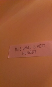
This image has been the most successful. This is because, the background of this image is kept plain, it's all in one colour. As the background is plain, it makes the sign more obvious. Moreover, the composition of the sign is quite central. The sign is at around the centre of the image, although the sign is too below, if it had been directly put in the middle of the frame then it would have had been better. However, compared to the previous set of experiments this one is improved in some areas. For example, before the sign was pink which took too much attention, so rather than looking at what the sign was saying, the colour stood out more distracting the writing on the sign. With this sign, it is white with big and bold writing, this fits in with David Shirgley's concept, focusing more on the writing rather than the design of the sign.
|
|
|
|
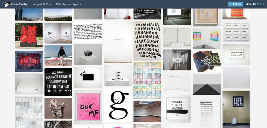
Using an app called Glitché which can be found on the app store, I edited the previous images from my experimentations. When editing the images, I was inspired by a tumblr user called visual-poetry,
EBI: If the images had more colour or focus, which would make the images stand out more WWW: I was successful with the editing. The effects really stand out making the image more interesting.
EBI: These set of images could be improved, for example the signs used in the images could've been more layed out. If I had thought more about where to place each sign.
|


Improvements
|
As I wasn't entirely satisfied with my previous set of David Shrigley experiments, I have decided to retake those images focusing on certain areas. With some of the other images, I did not like the composition, I wanted to make the sign the main focus and because of the composition of the image this wasn't successful. What I have done differently now is that I have taken those images again but, looking at different angles. With some of these images, the sign is at the corner or at the middle of the image. I wanted to experiment more thoroughly with which composition of the sign would look better.
|
|


NEXT STEPS
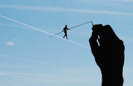
What I plan on to do now is apply my knowledge of signs and combine it with the idea of forced perspective. Looking at David Shrigley's work, he uses a lot of hand made signs, similar to Pejac who also works around hand drawn. With Shrigley's work there is a lot of writing, however with Pejac he draws instead. I got the idea to look more at signs but in a different perspective, after researching different artists I found Pejac. With Pejac's work in some concepts they're like signs, expect there is no writing involved but drawing instead, similar to David Shrigley who also adds drawings to his signs. With my previous set of experiments, I have been mainly focusing on signs using paper,


Pejac
|
Pejac is a Spanish artist.
What's so interesting about Pejac's work is his style. He draws on windows giving the idea of an illusion, the drawings look real showing an interpretation of forced perspective. Which is really interesting as he is the first artist I've seen do this.
For example, with this image at first look you can easily assume that is real. However, with a closer glance you realise that it's not real, which is why Pejac's work is so intriguing. It gives an illusion and creates confusion.
Pejac's work is similar to David Shrigley's, as both artists use hand work and combine it with photography.
|
Experiments
Next Steps - Forced Perspective
|
Looking at Pejac, his work is similar to the idea of forced perspective. Pejac creates an illusion, making his drawing look real by using a certain angle.
|
|
Steve Zeidler
|
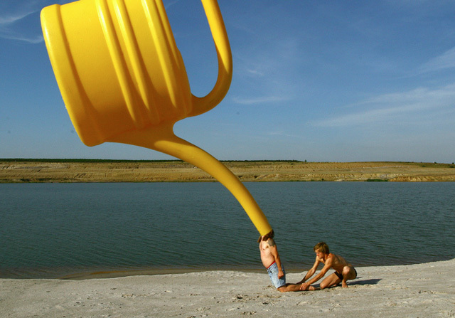
Born in 1979, Steve Zeidler is a freelance photographer and graphic designer.
Steve Zeidler as done images that are forced perspective also images that look absurd. For example, with this image the idea of forced perspective and absurd is used. There is a watering can really close up which gives it the illusion that it's really big compared to the two people, when in reality it's really small. Moreover, I also like the quality of his images, the bold colours and strong focus give the images a more define definition. The background and foreground of the image are both plain, making the watering can the main focus. For the composition of this image, watering can is slightly to the left of the image instead of the middle, this is to gives the can a strong focus. Also, as the watering can gives an illusion of it being big which takes up a lot space in the foreground. There is a strong focus on the image, the bright and high definition colours gives the image a strong visual.
|
http://www.froodmat.com/
|


Experimentation
I've taken another series of images, inspired by Steve Zeidler. With these set of images I focused on the way Zeidler would capture his images, for example the background of the image is plain and simple however, the objects in the images give an absurd feeling.
WWW: I've been more successful with making these images look absurd. The idea of these images came from Steve Zeilder, I used his concept of making objects in the images such as, people doing unusual things. For example, the second image works well because, the person in the image is holding a foam head, which in reality doesn't happen all of the time. The background of the image is plain with just a building, similar to Steve Zeilder who also leaves the background of his images looking natural and plain.
EBI: What could be improved about these images is the quality, but I plan to edit using photoshop for a much brighter image. Also, plan on taking more well composed images. Another thing which could be improved is the background of the images. For example, with some of these images they would've been better off with a plain background, like the sixth image. Because there is so much in the background, the background is distracting and not much is happening in the foreground. Moreover, the colour of these images are quite dark, which I didn't plan to happen. One of the main things that I liked about Steve Zeilder's images was the colour and how bright his images are. Therefore, with the colour and tone of the images I haven't been so successful.


|
|
My previous images came out quite dark, so using an app called VSCO I adjusted and changed the brightness, temperature and contrast of the images for a better outcome. This is because, my previous set of experiments didn't have much colour and the background of the images was dark. I looked at the three images which colour wise I didn't think turn out so good, therefore using VSCO I have increased the brightness of the images, as well as the temperature and contrast. This made the images more brighter, but I still wasn't satisfied with the colours in the images. Although, I change the brightness of the images, I still wasn't satisfied. I then added a filter to the images, which would make the colours stand out more.
|


Mary Ellen Mark and Erwin Wurm
I took some more images specifically inspired by Steve Zeilder. These set of images a slightly improved versions of my previous images, as composition was one of the things that I wasn't so satisfied with. Which is why, for these set of images I have focused on composition and layout in more depth. These images were also inspired by Erwin Wurm and Mary Ellen Mark.
WWW: What's so effective about these set of images is that it captures the idea of images being absurd. For example, although the first three images are quite similar I have done this in purpose. This was to take as many images as possible using different angles, this way I was able to see which angles worked out or how I could improve the images, composition wise. Also, there isn't much happening in the background it is quite plain, so there is more focus on the foreground.
EBI: These set of images were developments of my previous set of experimentations, so they're better.


|
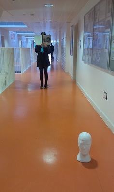
This image has been the most successful out of the set of experiments. With this image I was influenced by Erwin Wurm, Mary Ellen Mark and Steve Zuilder. For each area of the image, I had somehow been inspired by these three artists.
WWW: What went well with this image was mainly the composition. The props used in the image have been played out in order to make them stand out. For example, there is a girl standing holding a book in the background and in the foreground there is a head piece on the floor. This creates an eerie feeling, it is almost as if the girl is unaware of what is in front of her. Looking at Mary Ellen Mark's work first of all, her work is almost like street photography. It is about capturing what is already there but giving it an absurd effect to it. Similar with this image, the girl stand seems like an everyday situation, the image can be passed as the concept of street photography. However, with the use of the foam head in the foreground, it completely changes the plot of the image, giving it an absurd feeling to the image. Furthermore, in the distant background there is another figure. Another person standing. This wasn't intentional, but again this adds to the eerie feeling. There is a mysterious figure in the background, which again makes it seem like the girl doesn't know what is behind her either.
|
For further experimentation, I plan to develop my experiments. I will look at Steve Zeilder's work in more depth and analysis it to help me, so with my next set of experiments I will roughly have a clear idea of what kind of pictures to take.
Looking Back and Further Ideas
|
Looking back at my previous sets of experiments, I have used masks as a prop in my images. This was at the beginning, when I was getting to understand the concept of absurd. I wasn't exactly satisfied with those sets as only about two images turned out successful. But, picking up from that I have researched Steve Zeilder's different kinds of work, and in one of them he uses mask. As the masks before didn't work out for me, as those images were taken without any artist influence. Therefore, I plan to go back and work on them again with the influence of Steve Zeidler's "Masquerade" work. The previous mask work did not make much sense and did not link up with my research artists, so I now plan to develop those images by looking at Zeidler's work and getting some inspiration.
This image could easily be improved now. I have experimented with different styles of different artists, now I plan to use those skills such as Mary Ellen Mark's street photography and apply them to the mask work.
|
|
Steve Zeidler - Masquerade
|
|
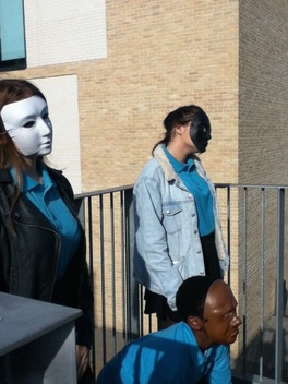
Continuing with looking at Steve Zeilder's work, he does different set of images which all have different concepts. One of the set of images is called "masquerade", where Zeilder focuses on masks. What's so interesting about his work is what kind of props he uses in his images. For example, he has normal people wearing masks performing normal actions. The second image and the third image are quite similar, because both images consists of wearing masks. But, with the third image specifically, the person is sitting on a chair casually, but the background of the image is quite flashy.
What's the most interesting thing about the second image is how it looks like an everyday situation, but with the use of the mask, the image looks confusing and strange. The person is looking out of an old looking window, in a casual position with no movement. The colours around her are quite plain and not exposed to any bright colours, but her top stands out with it being the only pink thing in the whole image. If the mask was not there, then this image would look normal, but with the mask it looks confusing. As it why the person is wearing a mask. Also creates an eerie feeling.
|


Experiments


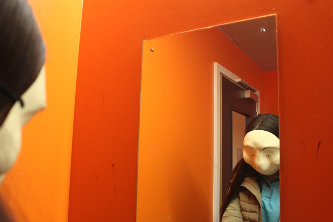
These set of images were inspired by Steve Zeilder. I liked Zeilder's use of masks in his "masquerade" work, he had people wearing masks during normal situations. For example with my set of images, the second one is of a girl wearing a mask casually sitting down while looking in the mirror. What's so absurd about this image is the use of the mask, how she is
WWW: I used a mask as a prop for the images, and the use of the masks came out really well. For example, the images where the girl is in front of the mirror. There is also one where she is in front of the mirror, looking down at the gun that she is holding. With making an image look absurd I was quite successful, this is because I had been inspired by Steve Zeilder.
EBI: Although, these images came out as planned there are still some areas that need to be improved. For example, the background of the images. The background makes it really obvious to where the girl is, so I plan to improve on the background. With my next experiments I will have the same concept of the masks like with this set, but the background will be different. To give it a more absurd feeling the background of these images could have been a toilet, have the girl with a mask on looking in the mirror in a toilet.
Developments


|
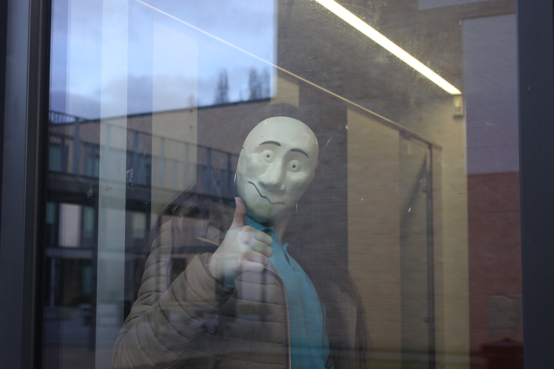
This has been the most successful image. Looking at the image, I have used a mask as a prop which was inspired by Steve Zeidler, what went well with this image is that the image gives an abnormal and eerie feeling. The girl is quite close to the camera, therefore instantly the attention is gone to her. With the background, there could be improvements, for example, there is too much in the background, also the building is reflecting on the window which overlaps on top of the girl. Moreover, the composition could've been changed to fit in, so that the building wouldn't reflect on the window. But, what went well overall, was that this image was inspired by the window image by Steve Zeidler, so I used the idea and in the image the girl is performing a normal action. She is simply putting her thumb up, which shows positivity. But with the use of the mask, this completely changes the positive feeling giving an eerie and abnormal feeling. Perhaps to why is the girl wearing a mask and putting her thumbs up.
|
|
Keeping in mind areas that I needed to improve on from my previous experiments, with these set of images I focused on composition and background as I wasn't satisfied with my previous experiments because of these two things.
Further Ideas
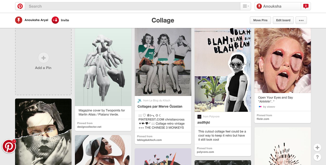
So far I have experimented with Steve Zeilder's work and looked at masks. Looking back at signs, I have inspired to do collages. Using pinterest, I have looked at some ideas of collage, and how it can relate to my work. Whereas Steve Zeilder uses masks to cover the face and make it look abnormal, he uses masks that don't look like normal faces, he uses animal masks. Also, picking up inspiration from David Shrigley, I plan to use his technique of signs and hand work and combine that with Steve Zeilder.
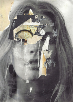
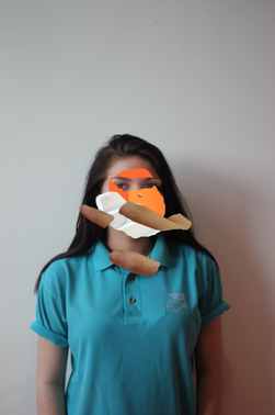
Yann FauconYann Faucon's work is really interesting. This is because, with Faucon's work it looks rough, like it has been rushed. This is because of the quality of the work, it looks like the artist has torn up paper and created layers of it to cover the face. It gives an a quick and rushed feeling to the piece. With the eye, the artists has used torn up bicycle image and placed it on top of the eye. This looks like she was trying to
|
|
|
Waldemar StremplerWaldemar Strempler is photographer.
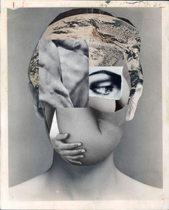
Similar to Yann Faucon, both artists work with collages. The only difference between both artists is that, wheres as Faucon's work looks rushed and quick, with Strempler the work looks priscely cropped. For example, the artists has cropped the body and hand image in a certain shape so that it can fit in with the chin. An eye image has be placed on top of an eye, however only on one side of the face. This has an eerie effect, as the eye isn't looking directly at the camera but instead to the right. With only one eye, the whole collage looks confusing.
|
Experiment with Photoshop
To experiment with Yann Faucon and Waldemar Strempler's work, I have taken a set of images. I haven't really focused on things like composition, as these images will be used to make collages, therefore they will be cropped and edited. EBI: Although these images are used as part of my experimentation and later on will be edited and cropped out, I didn't really focus on the main elements. For example, some of these images are out of focus, which I didn't intend it to be. If I had focused more on the camera angle and focus, and all of these images could've came out quite successful. WWW: These images are still successful as I took images of what I needed to, and managed to do so. However, because of a few camera difficulties some of these images came out with no focus, and blurry.


Response to Yann Faucon
|
|
I have studied Yann Faucon's work. which is why I have used photoshop to get the similar effect as her work. This is because, with Faucon's she does college hence I had to use photoshop in order to crop out images. EBI: I plan to make more. However, with these set of images I have edited them digitally using photoshop, to achieve more of Yann Faucon's style, I plan to hand do them. For example, print out each image separately and cut them out making a collage inspired by Yann Faucon. This is because, with Yann Faucon's work there is visable proof of images being teared and ripped. This gives her work a damaged look, because all the images she's used haven't been carefully cropped, e.g the way I've done with mine using photoshop. WWW: I was able to use my images and edit them with photoshop. These images are quite successful as looking at Yann Faucon's work she covers the face using other cropped images. Inspired by that I have done a similar thing.
|


|
This is the most successful image from the photoshop experiment. The compoistion of the person is central, she is placed in the middle of the whole image. This makes her the first thing someone would notice. Another thing is that the images used aren't precisely cropped, something that was also inspired by Yann Faucon.
I combined three artists work together, for example with the images that I took that were inspired by Steve Zeilder, I edited them using photoshop, in the style of Yann Faucon and Waldemar Strempler. I have currently only experimented digitally
|
|


Final Pieces and Evaluation


For my final piece, I have choose these set of images. I first began off by experimenting with various of different artists to help me understand the topic "absurd". This really benefited me, because by experimenting with different artists many times I was able to look at what areas that I need to improve on, and what I could do to make these improvements.
I began with researching Erwin Wurm, after the research I got a rough idea of his style. From the research I did my first set of experiments, "hiding", which was inspired by Erwin Wurm. Wurm used objects such as chairs and had people hold the chairs unusually in his images, in most of his work many people in the images were hiding, which gave me the idea to look at "hide".
When looking at forced perspectives, I came across Steve Zeilder. I experimented with Zeilder many times, because I wasn't satisfied with the experiments. This is because, with some images I didn't like the composition or the lighting, which is why I decided to look at his work again and attempt another experiment. With my second set of experiments inspired by Steve Zeilder, I looked specifically at masks. I got the idea of using masks from his "masquerade" work. I liked the mask set of images more than my previous experiments, this is because after many experimentations, I understood the theme "absurd photography" clearly. The reason why I wanted to work with masks was because I was mainly inspired by Steve Zeilder, I liked his idea of having people wear masks and performing normal actions. This had an eerie feeling, as the masks looked absurd but they were acting normal and casual. I liked how the faces were covered, and something as simple as wearing a mask had a huge effect on the image. After looking at Steve Zeilder's work I felt more confident to do further experiments. Furthermore, by experimenting with masks I also got inspired to do collages. This is because, I liked the idea of hiding the face with other images, and giving it the weird feel to the whole image. To research for new artists that had their work based around collages, I looked at Pinterest to help me find artists. I came across Yann Faucon's work and Faucon's work inspired to look at collages. Originally I wanted to find photographers who had their work based around masks, but with Faucon's work it was quite similar expect she used layers of other images to cover the face, so decided to experiment with collages too. Because I was intrigued by Faucon's work, I also researched Waldemar Strempler's work. I then took some more images to help me, as collages involve using different sets of images. Using photoshop I was able to create some collages, by combining the images that I took which were inspired by Steve Zeilder and images as part of my Yann Faucon and Waldemar Strempler experiments.
WWW: Overall, I am satisfied with the final outcomes. I've chosen these images specifically because they're a combination of some of the artists that I have researched. I looked at Steve Zeilder, Yann Faucon and Waldemar Strempler's work. I was really pleased with my Steve Zeilder experiments, the whole use of the mask inspired me to look at more photographers. All three artists are quite similar, in each of their work the face of the person is hidden. I was planning to do something with masks like Steve Zeilder but with pinterest I found other artists, which gave me the idea to make an image absurd by covering it with layers of other images. Which is where I decided to look at collages, and with the use of Photoshop and a camera I was able to do this. Photoshop mainly helped me to achieve my final pieces as I was able to crop out images and place them, creating layers of images.
Overall, I am pleased with my final set of images. Although. I had some difficulties in the beginning, I was later able to find inspirations from other photographers which I helped me achieve my final set of images.
