Groups
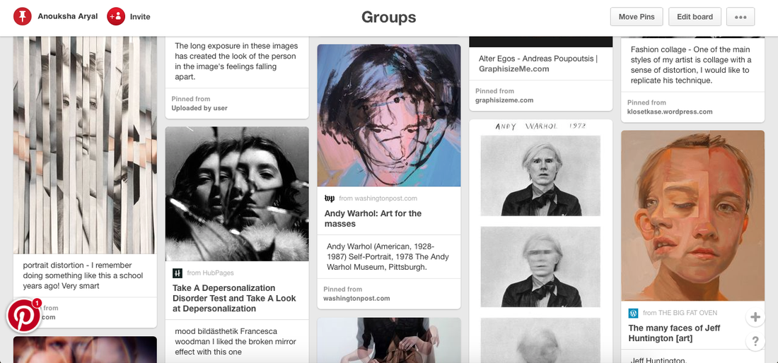
For my unit 2 project, I have decided to look at the theme "groups". I chose groups as my theme, as I can look at a wide range of things within it. Such as, collages, or multiple images, the whole theme "groups" varies and I feel like I will be able to expand my knowledge. I began with using pinterest as my starting point, pinterest helped me look at work done by different photographers, I became more interested in groups as each image from pinterest related to groups but in a different way. I came across a lot of different work done by artists. Duane Michals' work looked really interesting and stood out to me the most. I first came across her work of Andy Warhol, where she took three images of Warhol but each image had a movement going on within the image. Looking at Duane Michals' work, she keeps it very simple yet the actions within the images hold a meaning and make the entire image look more meaningful.
Duane Michals
"Photography deals exquisitely with appearances, but nothing is what it appears to be."


|
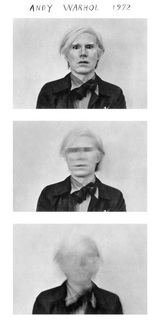
Duane Michals is an American photographer; Michals work involves sequences and occasionally texts, often to examine emotion and philosophy. What's so interesting about Michals work that invoked me to research him, was the simplicity in his images which was used to show movement and certain emotions. For example, this image of Andy Warhol is one of my favourite work done by Michals, it is kept simple with only black and white effect. There is no colour, hence the background is in one tone. Furthermore, Michals has captured movement in these set of images, it is a sequence of three images, where in each image there is a different sense of movement. This kind of theme consists in mostly all of his work, where he has a sequence of images with stillness or movement within the image. Another thing about this image is the composition of it, Andy Warhol is kept at the centre of image which makes him the main focus. As he is placed at the centre, with nothing around him and a plain background, it becomes very obvious that he is the main subject of the image.
|
|
Duane Michals Response
|
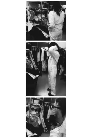
I took some images separately, then put them all in a collage. I was inspired by Duane Michals' work. Looking at her work, she does collages showing people's actions. Similar to that idea, I took some images, put them in a college, presenting everyday movement with the use of a collage. This shows the concept of groups, as it's looking at a group of images to show movement or stillness. WWW: What went well with this was that I was able to take images and then change them into black and white. I used an app called VSCO Cam to do this. One of the thing that's successful about this is that I was able to capture the movement. For example, it is clear when looking at the images that the person within the image is doing something. Because I put three similar images with different composition together, it shows the movement and change in each image. EBI: If these images had blurriness or where out of focus then this would really help the movement within the images stand out. For example, the image by Duana Michals of Andy Warhol, the first image is in clear focus but the rest slowly fade out of focus. The background in this image also has a lot going on, this was done intentionally. Michals work also has a busy background, which is why I have done a similar thing and not make the background clear and all in one colour.
|
Rinko Kawauchi
|
Photographs from "Cui Cui".
|
Rinko Kawauchi is a Japanese photographer. Her work is characterised by poetic style, showing the ordinary moments in life.
Rinko Kawauchi's work is really intriguing, there is a lot of simplicity but the kind of images make her work really interesting to look at. For example these set of images are from her "Cui Cui" work, she captures basic everyday situations but with the rich and light colours make the images stand out more. With these images each two images consist of one colour that stands out for example for the first two images, green really stands out. The colour of these images really quite light, almost giving a washed out effect. Similary to Duane Michal's work, both artists have the idea of capturing groups of everyday situation, the only difference is that Kawauchi doesn't show movement in her images. The objects or people in the images are still, Kawauchi has been very successful at capturing this
|


Rinko Kawauchi Response - #Group 1


I began off with exeperimenting with Rinko Kawauchi's work. I focused on the idea of capturing ordinary objects or moments in life, which is very similar to her work. I tried to keep the images simple, as her images were simple yet full of colour. To achieve the high sense of colour, I edited the brightness of these images on an iPhone and using an app called VSCO Cam, I added an effect to the images. Another thing that I focused on was taking close up images. Angle wise, these images are successful as one of my main aims was to take images from a close up angle. EBI: some of these images are quite dark, therefore I will re attempt those images, making them lighter. WWW: But overall these images relate to the context, "everyday situations", so these are everyday household objectives.
Developments


|
|
As I wasn't satisfied with the brightness or colour of some of the images, I re toke them. With the image of the left, I edited the exposure and temperature. However, before this I added on a filter which defined the image's colour. With the exposure, it allowed me to make the image brighter, something I had a problem with in my previous experiments. I wasn't that pleased with the brightness; therefore with this image I edited out the brightness to a extend that satisfied me. Furthermore, the temperature allowed me let the colours of the image more exposed, it created a blue undertone. Looking at Rinko Kawauchi's work, I noticed that quite a lot of her images had a blue undertone, that really inspired me. Which is why I have gone for more of a blue tone with the colours in the image. Also, by doing this I got to experiment more, allowing me to understand the area's I might need to look at more.
|
Group 2
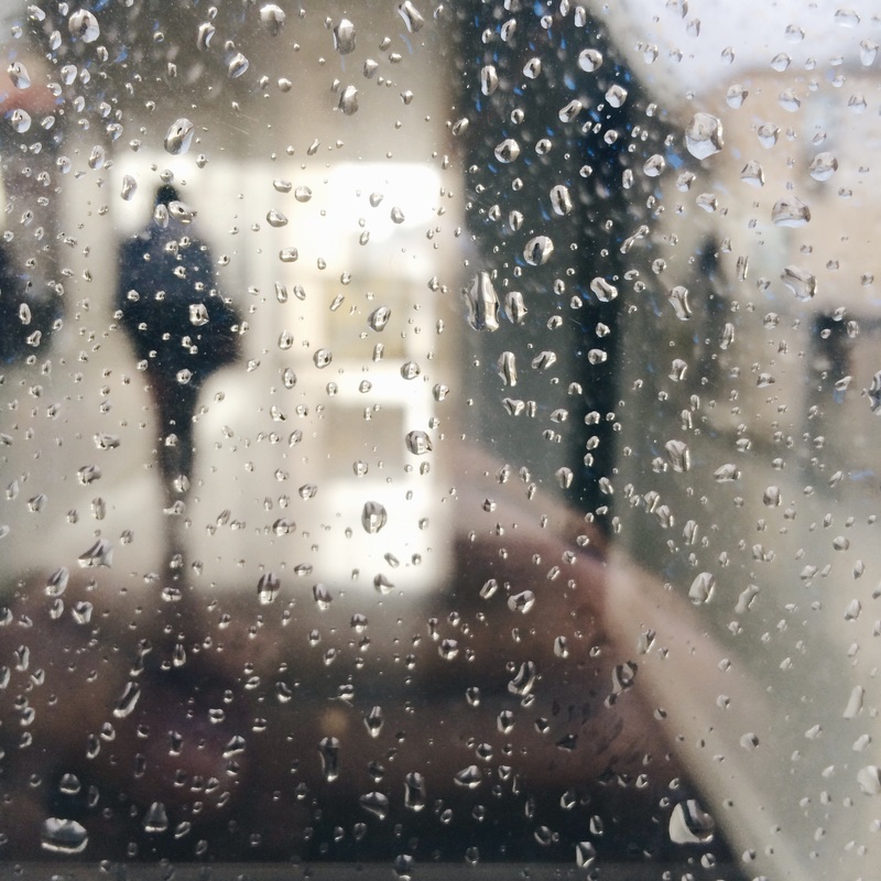
I have taken another set of images linked to everyday events. The rain represents weather, whereas the fake blood can have a deeper meaning. The holding the glass images are quite simple, they simply represent the everyday actions of drinking.


|
Continuing with the idea of having a group of images that represent or show everyday events, I have taken another set of images that relate to the idea. With these set of images, I have focused on simplicity where the background is kept plain, something that I had been influenced to do by Rinko Kawauchi. Looking at Kawauchi's work it is very simple but as she takes quite a lot of images that are close up, it makes the image seem intriguing as it is a close up, therefore the viewer can't see the full image. Inspired by this, I have also taken some close up images, where I have kept the background to be plain for example, a white background, so that the main focus can go to whatever object is within the image. WWW: These set of images look naturalistic, giving it a simple effect. For these images I used an iPhone hence the images look standard quality and smooth and plain. One of the most interesting image is the fourth one, this is because the background is out of focus, so only the foreground has a strong focus. In the foreground there is a strong focus on the rain drops. EBI: These images are satisfying but they could also be improved. For example they look confusing together, although the lighting and colour in each image fits together, it doesn't really relate to the idea of "everyday situations". Compoistion wise, I have been successful also with the lighting and colour, however the context of these images don't make sense. To develop these images, it would be better take another set that clearly show "everyday situations", keep the same tone and lighting, but just change the way of taking images and what I am taking an image of.
|
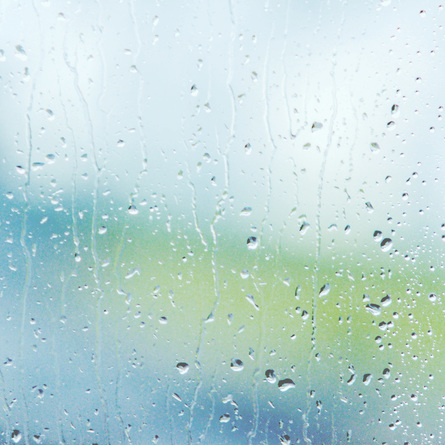
Rinko Kawauchi's ImageThis image by Rinko Kawauchi was my main inspiration for the image at the top. I was successful with doing a response, where a took an image similar to the one done by Kawauchi here. For example, the the background is out of focus whereas the rain droplets are in focus and clear.
What I like about this image is the colours in the image. The colours look
Another thing interesting about this image is how the background is completely out of focus, but the foreground is clear and in focus, Also, unlike my image where a figure is almost visible in the background, unlike this image where you cannot see a figure. There is a bit of greenness in the background. |
|
Photoshop Experiment


Development


|
This image is the most successful, this is because
WWW: What went well with this image compared to the others is that the background is out of focus, something similar to the previous experiment I did. The foreground is out of focus along with some focused areas. For example, on the right area of the image, the rain droplets are quite visible as they are in focus, so they are clear to see. However, on the left area of the image. the rain droplets are quite out of focus, unlike the other side. This wasn't intended. Furthermore, with the background because it is out of focus it is unclear, but with the use of colours in the background EBI: I had previously done an experiment where I had looked into closeups of rain droplets, with this I was inspired by Rinko Kawauchi. As I was quite successful with my previous experiment, I wanted to develop and see whether I could do something more improved. images don't relate to my theme, as they're just a development of my previous experiments; where I look at a group of images representing everyday situations.
|
|
More Rinko Kawauchi Experiments - Group 3 #Journey


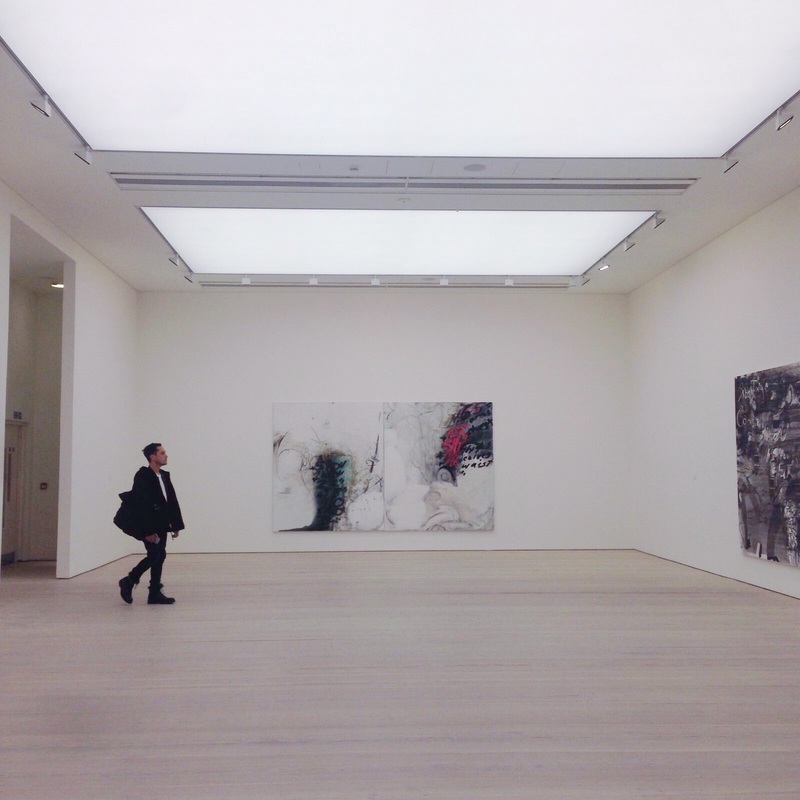
Continuing with the idea of everyday situations shown through photographs, I have taken another set of images. These images link to everyday situations as it shows a journey, for example the images let the viewer to also experience the museum and the work there.
|
WWW: Personally, this image is the most successful. What went well with this image is that, it is quite simple. For example in the background the walls are plain white with pieces of work displayed. The whole image in general is quite simple as it consists of a colour scheme. The person on the left side of the image makes it more interesting. This is because, the compoistion of the person isn't central, they are at the far end of the image. However, the reason why the guy stands out is because of his clothes. His dark clothes in the foreground stand out with the plain white and creamy background.
EBI: Although this image is successful, there is still one thing that could've been better. For example, the colour of the image. The colour isn't similar to my previous set of images, those images consist of mostly a blue tone. Whereas, for this image, there is more of a creamy white tone. Therefore to improve this image, I will reedit the image, changing the brightness and temperature. The temperature will allow me to create a cool blue tone to the image, this way this image can also fit into the other group of images. |
Takashi Homma


|
Colour wise, Takashi Homma's work looks simlar to Rinko Kawauchi's. For example, this is a blue undertone within the images,
This is one of my favourite images by Takashi Homma. It is quite similar to the image that I took in my previous experiments. Homma has captured movement, which makes the image really intriguing. There is movement of vehicles, which represents the idea of taking images of everyday situations. There is a blue tone to this image. similar to Rinko Kawauchi's work. The colours within the image are quite similar.
This image is quite similar to my previous experiment where I have also taken an image of the road, where a moving van is visible. |
Takashi Homma Response - Group 4 #Journey


I have again experimented with taking images of journeys, but this time in more of a style of Takashi Homma, These images are quite different from my previous set as these images have a more detailed background and foreground.
|
I have taken another set of images that have been inspired by the concept of street photography. I got this idea from Rinko Kawauchi's work, looking at her work I quite liked how her images showed everyday situations. She presented ordinary moments in life by taking groups of images. This also intrigued me and inspired to look more into the idea of street photography. Similar to street photography where you have to take images of everyday situations, Rinko Kawauchi's work inspired me to look into that idea in more depth. Therefore, picking up this concept, I have taken a set of images while walking home. These images present movement. WWW: What went well with these set of images is that although they're my first set of images where I look into the concept of street photography, I have been successful in doing this. The image on the left is the most successful one, for example in the background there is a girl standing. This is slightly absurd as she isn't very noticeable because of the van in the foreground. So it might take the viewer some time to notice her, which is interesting as it almost looks like she is camouflaged in with the background.
|
|


These images were mainly inspired by the photos that Takashi Homma took of her daughter. These images are also similar to Rinko Kawauchi's work, as with these images I also focused on capturing the everyday movements. Similar to what Takashi Homma did of her daughter, where her daughter is seen satul, this is something I've aimed for. The person in the images isn't seen doing very dramatic movements, these images present that person's everyday movements. These images can be seen as ok, although I haven't experimented thoroughly as I was just trying to get a rough idea of her work. Moreover, because Rinko Kawauchi and Takashi Homma's works are quite similar, I felt more confident when experimenting.


With these set of images, it was just an experimentation. I was continuing with experimenting with the everyday situation images. With these images I focused more on compoistion and how objects in the image can be placed as, also I focused on the angle of the image. With some images I taken them at a certain angle where not all of the object within the image is visible, this had been done intentionally. This is because, I was experimenting with what kind of angles I was successful at taking images and what angles I wasn't so successful.
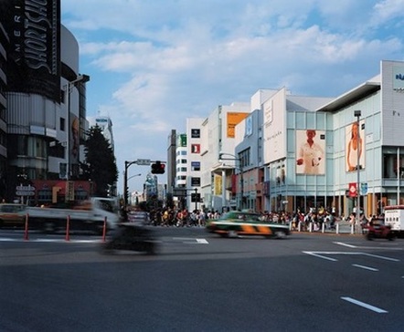
Ryudai Takano


|
These two image by Ryudai Takano are my favourite ones. There is a lot of colour, unlike Rinko Kawauchi's work; which is based around a specific colour or tone. The wide range of colours make the images more interesting to look at, not only are there a group of people but there is also a group of colours. Furthermore, I like how Takano's work fits in with street photography. In these two images, Takano has been able to capture the busy streets, which goes with the theme of groups as within both images, there is a group people. I got the inspiration from Takashi Homma's work where she has captured a road, that show the movement of cars. Similar to her, Takano has a similar concept, capturing a busy place. However, instead of cars, Takano's work has people. Both background and foreground look busy, as in the background there are big bright signs that make the image stand out. In the foreground, there are people walking around. This creates a sense of urgency, the group of people look like their just continuing with their everyday lives.
|
|
Ideas
So far I have researched different artists who's work is based around the similar things. For example, I started off with researching Duane Michals' work where I got the idea to look at taking a group of images. As she took images and put them together into a college format, it inspired me to look more into that and experiment with the idea. This linked to my theme of groups as I was looking at taking a group of similar images. From researching about Duane Michals' work, I found Rinko Kawauchi's work where she looked at something similar. She also took group of images, of everyday kind of situations. Similarly with Duane Michals' work where he also captures movement and everyday lifestyle moments. Another really intriguing thing about Rinko Kawauchi's work is how she works with the tone and colour of her images. This inspired me to also look at the tone and colour of my images. I done some experiments where I looked at the similarities of each image, for example the colour and tone. Moreover, these images were also inspired by Rinko Kawauchi, as I also looked at how these groups of images related to my everyday situations. I then took images of what I see when walking, inspired by the concept of taking group of everyday situation of similar colour and tone. I then found another artist who worked around this concept as well: Takashi Homma. Eventually, Ryudai Takano inspired me to look further on. Takashi Homma's
Kenji Hirasawa

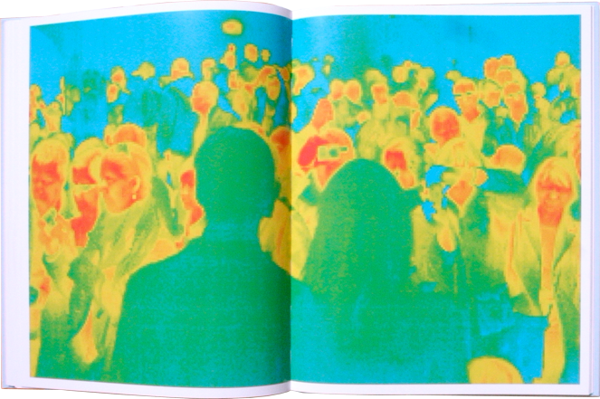

Continuing with look at the theme of groups, I have decided to research and look at Kenji Hirasawa's work. I got the inspiration from Ryudai Takano's work. For example, Takano's images of Tokyo involves groups of people, which relates to the theme of groups also the idea of how the theme of groups can be combined with everyday situations. Takano captures groups of people during their everyday situations. Similarly with Kenji Hirasawa's work, the difference is that Hirasawa uses a thermographic camera, giving his work a different effect.
|
This image by Kenji Hirasawa is really interesting. Similar to Rinko Kawauchi's work, Hirasawa's work also has similar colours within the images. Because of the use of a thermographic camera, the colours are quite similar. Furthermore, this image is hard to figure out, for example what is happening in the image. The compoistion of the people in this image is quite spread out, the people aren't in a fix area of the image. This is another thing that makes the image interesting, the image isn't in focus and the compoistion of each person is spread out, there is a group on the right side and another group on the left side. We are unable to understand the situation of the image, unlike the artists that I have previously researched where it is clear what the situation of the image is. With this image, it isn't so clear, the people's actions and faces are difficult to see. However, in Hirasawa's other work, it is easier to figure out what is happening in the image.
|
Kenji Hirasawa Response


|
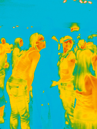
After researching Kenji Hirasawa's work I was inspired to do a response, take images inspired by the photographer. I looked at taking images of more than one person in the frame, to show a group of people. WWW: I was successful with using photoshop to edit the original images. I was inspired to add a similar effect to my images as Kenji Hirasawa did, for example the thermographic effect. EBI: What could be improved is the compoistion of the people within the images. For example, the background is still quite visible, even after editing out the images. With some of Hirasawa's work, the background is plain, all in one colour. I could make only have a group of people in the frame, and not have too much happening the the background, as I want the main focus to be on the group of people.
This is the most successful image from the experimentations with photoshop. This is because I like the contrast between the colours, the use of and yellow and an orange type of red is interesting as they blend together. The blue makes the image stand out more, as it is a colour that doesn't blend with the other two colours.
|
|


|
This is another image that I edited using photoshop. I researched Kenji Hirasawa and looked at his work as an experiment. Because Hirasawa looked at a group of people within one image, I also wanted to experiment with this style. Moreover, Hirasawa's work is based around specific three colours, he doesn't expand the colours in his work. Similar to an artist I previously looked at, Rinko Kawauchi.
WWW: What went well is that I was able to edit the image using photoshop. Because I did not have a thermographic camera, photoshop allowed me to achieve the same effect as Kenji Hirasawa.
Researching Kenji Hirasawa was just an experiment as I wanted to experiment with this style, thermographic effects. But, I didn't like the concept as much after attempting my own images as I found the process of taking images then later editing them using photoshop quite difficult.
|
Final Pieces


Final Evaluation
As my final pieces I have chosen these set of images. I've put these images into different sets to show my theme, groups. This is because from the beginning when researching Duane Michal's work, I was inspired to work with group of images as in a way he worked with collages. I later researched Rinko Kawauchi, whose work in a way was similar to Michal's. Similar to Michal, Rinko Kawauchi did group of images that showed everyday situations. For example with Duane Miachl's work he would keep it complexed (compared to Rinko Kawauchi), meaning the background in his images were quite intense. There was details and a lot happening, whereas with most of Rinko Kawauchi's work it is kept simple, where the background is either out of focus or all in one colour. Rinko Kawauchi's work then influenced me to work with similar tone and colour. For example, when experimenting with Rinko Kawauchi's style, I focused mainly on the colour and brightness of the image. Also because Rinko Kawauchi's work involved blue and faded tone, I later edited my images using VSCO Cam. I edited the images, where I increased the brightness and changed the temperature of the image to a colder blue tone. I then researched another artist whose work was similar to Rinko Kawauchi's work. Takashi Homma's work was on the same line as Rinko Kawauchi's work, both used the blue tone in their work. Moreover, both artists had the same concept of taking images of everyday situations. This is where I took images of my journey from school to home, this had been inspired by Takashi Homma. I looked at how Homma took images of roads and cars, so in a way I did a similar thing; I took images of the road and put them together with the other images to show a journey. This links in with the theme of groups as I took a group of images, where the images showed my experience. I was satisfied with those images as it was a group of Rinko Kawauchi and Takashi Homma inspired images. But, before I could move onto Takashi Homma, I developed the images that I took before. For example, with I developed images, because with a set of images I wasn't satisfied with the colour and brightness, therefore I took similar images again where I changed the colour and brightness and experimented with how I could change the colour and brightness. I then researched Ryudai Takano's work. However, I only just looked at his work, without doing a response or taking images inspired by him. This is because, his work was quite similar to Takashi Homma's, both took images of roads where within the images there were loads of vehicles or people. I did this to look at his work and think about how it could relate to my work, the research on Ryudai Takano was to give me more ideas and to understand the theme of groups more clearly; as at that point I felt quite stuck. After looking at Ryudai Takano's work I then looked at Kenji Hirasawa's work. Hirasawa's work was similar to Takano's in some areas, for example Takano's work involved group of people within the frame, similar to Hirasawa's. I then edit experiment, where I took images inspired by Hirasawa. I was interested in his style, also he focused on similar colour within each image, similar to Rinko Kawauchi. After some attempts of experimentation, I wasn't so satisfied with the outcome.
What went well with these set of images is that before choosing these images as my final piece, I was able to stick to my theme. For example, throughout the project I was able to focus on one theme, looking at group of images. These images are successful as I was able to develop and refine experiments, also I was able to edit these specific images using photoshop and an app called VSCO Cam. These images focus on simplicity as well as represent a journey. For example some of these images were taken at a museum, where I captured what I saw. It is a contrast between something that happens on a daily basis to something that doesn't happen so often. The images with the rain, blood and cup are supposed to represent more of an everyday situation. Whereas, the museum images show going to museum, which doesn't happen so often, or wouldn't be seen as something common.
